Originally they were in your eye - now they can be in your home! Or on your front!
The original poster designs of John Foy now celebrated in a range of quality limited edition formats…
ABOUT SKULL PRINTWORKS
SKULL PRINTWORKS originally existed as vehicle for the designs and screen printed posters by John Foy from 1978 to 1988. The earliest designs appeared under the initial name Fonebone Printworks before changing to the more familiar moniker. The final poster of the regular output was for The Riptides in 1988 - though Foy did break out the screen printing gear one final time in 1990 for a Red Eye Record Label end-of-year concert by the label’s leading Artists.
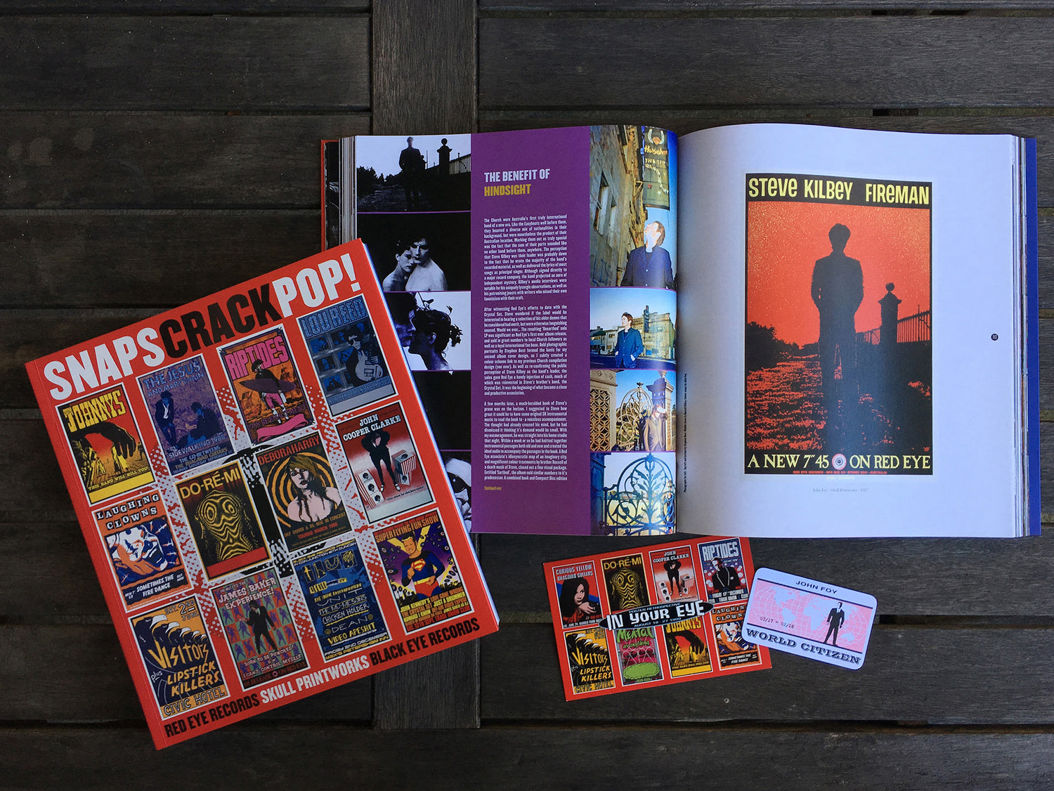
‘SNAPS CRACK POP!
A book containing a survey of the Skull Printworks output was issued in October 2018. ‘SNAPS CRACK POP!’ also documents the preceding years resulting in the establishment of Skull Printworks, as well as all that has followed. Skull Printworks is now back as an active entity, first to republish the ‘SNAPS CRACK POP!’, then to action some exciting new projects involving the popular designs executed by John Foy in his prime. Watch this website!
A BRIEF HISTORY: JOHN FOY / SKULL PRINTWORKS
JOHN FOY was born in the southern suburbs of Sydney just prior to the dawn of the 1960’s. As the 70’s ticked away, the adolescent Foy found himself drawn more often to the excitement that the inner-city offered. In the process he swapped his previous musical interests for the darker energetic appeal of Radio Birdman and the Saints.
In the pursuit of his growing musical obsession, Foy frequented the most left-of-field of a number of independent record retailers, White Light Records. It offered an array of imported recordings not otherwise available in Australia. In the absence of weekly street press, ‘indie’ stores like as White Light were key tastemakers and centres of communication in respect to contemporary musical developments. Such stores would later become the pulse which large record companies and concert promoters observed in order to keep track of emerging trends.
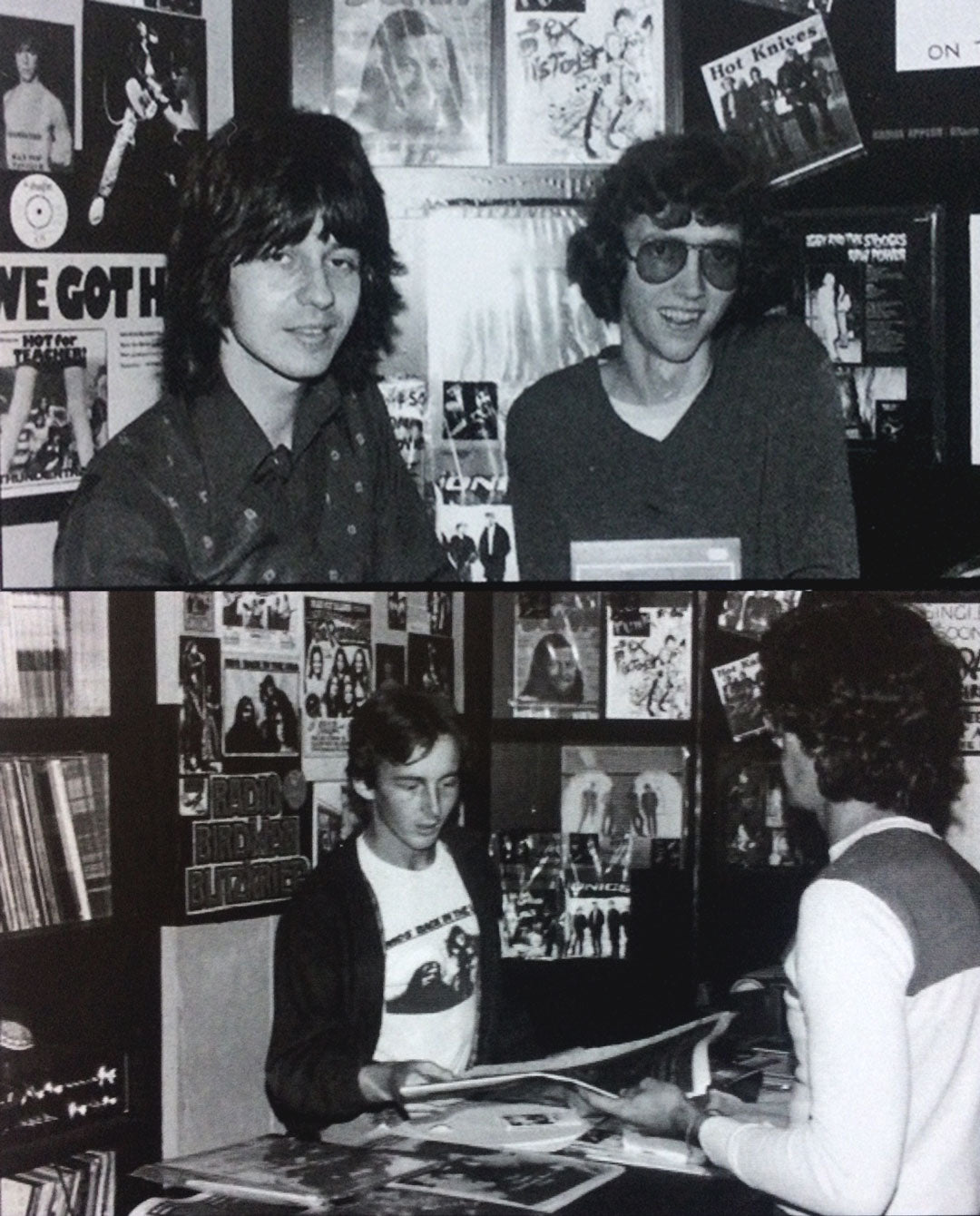
Photos: Proprietor Mark Taylor and colleagues Lee Taylor & John Foy in the original White Light Records store - circa late 1977.
To the soundtrack of debut releases by Patti Smith, The Damned, the Ramones, and many others, Foy inevitably became a White Light employee. It was there that he developed a broader musical knowledge and established a rapport with the local alternative musicians of the day. Additionally he observed the new rise of independent record labels and bands, and their distinctive graphics.
The initial Punk / New Wave bubble burst in late 1977. White Light with its similarly steadfast attitude, died with it. Foy found himself in the real world for the first time, in need of a job. As an extension of a high school art interest, he scored a job as a trainee screen printer. After 12 months Foy had mastered most of the processes involved and had begun being bored with his outlook.
Entrepreneurial T-shirt screen printer Dare Jennings had meanwhile purchased White Light’s dormant stock to realise a long-term dream by opening a record store. In the process, he invited the former White Light staff into a partnership. Phantom Records opened with Foy gladly aboard.
As fate would have it, Foy asked one too many questions of his new-found employer / partner’s screen printing operation and eventually found himself being bumped from record retailing to T-shirt printing for his troubles. It was while at Phantom T-shirts that Foy was called upon by his inner-city musician housemates to design a poster for a forthcoming show.
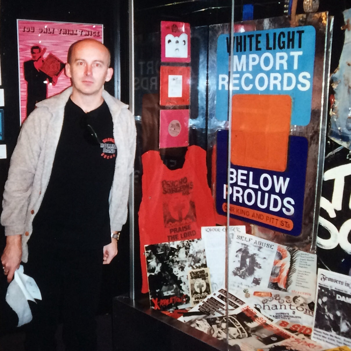
Photo: John Foy alongside Punkulture exhibit at the Australian Museum, Sydney - circa 1997.
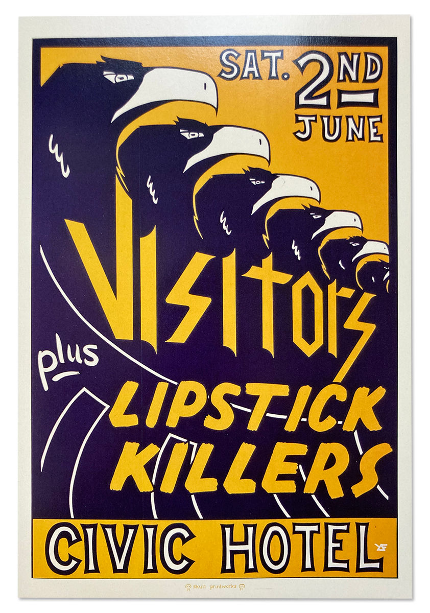
The design, for The Visitors & the Lipstick Killers at the Civic Hotel, was duly executed and farmed out for printing. All and sundry liked the results - except Foy, who was unhappy with the standard of printing. Determined to control the entire process if ever a similar opportunity presented itself, he set about learning more about printing on paper. Jennings provided encouragement by allowing Foy to broaden his skills after hours in the Phantom T-shirt premises.
And so ‘Skull Printworks’ was born. To identify his position as designer, Foy reversed his name to ‘YOF’ and for signature utilised a geometric symbol from his high school war gaming days.
Necessity being the mother of invention, Foy’s initial poster efforts were executed with water-based fabric inks rather than the conventional turps-based pigments intended for paper. Although he found the dilemma of rippling paper and other problems challenging, such situations led to experiments, frequently with interesting new results. As far as Foy was concerned, the method became as intrinsic to the final result as the design itself.
In that pre-computer design period, most creations included laborious hours of ruby-lith stencil cutting, sometimes supplemented with film bromides of central images. Often with limited time to develop ideas, Foy ‘magpied’ images from his favourite cult TV shows, such as The Avengers, or Danger Man. Such re-interpretation had immediate roots in 60’s San Franciscan psychedelia, and was still equally acceptable behaviour in the 1980’s.
Image: The 1983 screen print edition of Foy’s 1st-ever rock poster - designed in 1979.
By the time Foy departed from Phantom T-shirts, he had also established a style of posters to promote the releases on the fledgling Phantom Records Label to date, and had provided a number of cover designs. With a regular stable of clients such as the Flaming Hands, Riptides, and promoter Ken West, Foy established his own screen printing studio in a Surry Hills warehouse. A somewhat ‘Renaissance’ period for him, he continued under the monicker ‘Skull Printworks’, creating works at an unprecedented rate. He had accrued sufficient faith from his clients to the degree they would simply advise date, venue, and song or tour information - the rest was up to Foy. He had a blank cheque in terms of imagery and colours.
No preliminary sketches, no interference - apart from the usual managerial insistence that the relevant information was legible from a moving car. Likewise, sometimes a design would require a generic box to allow for over-printed or hand-written details to be added later. The challenge to create something other than just a box was a recurring design pursuit. In most cases Foy charged for printing expenses only. By not charging for the design component, he retained the copyright.
When the Red Eye Records store opened on almost exactly the same site as White Light Records, it seemed inevitable that Foy would be approached to join the team. As well as the daytime shifts in the store, he continued designing and printing posters by night. Observations from Phantom were eventually applied to the newer situation when the Red Eye Record Label was conceived. As well as helping to profile the record store, it assisted various Skull Printworks clients by releasing their music that larger record companies were yet to be attuned to.
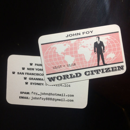
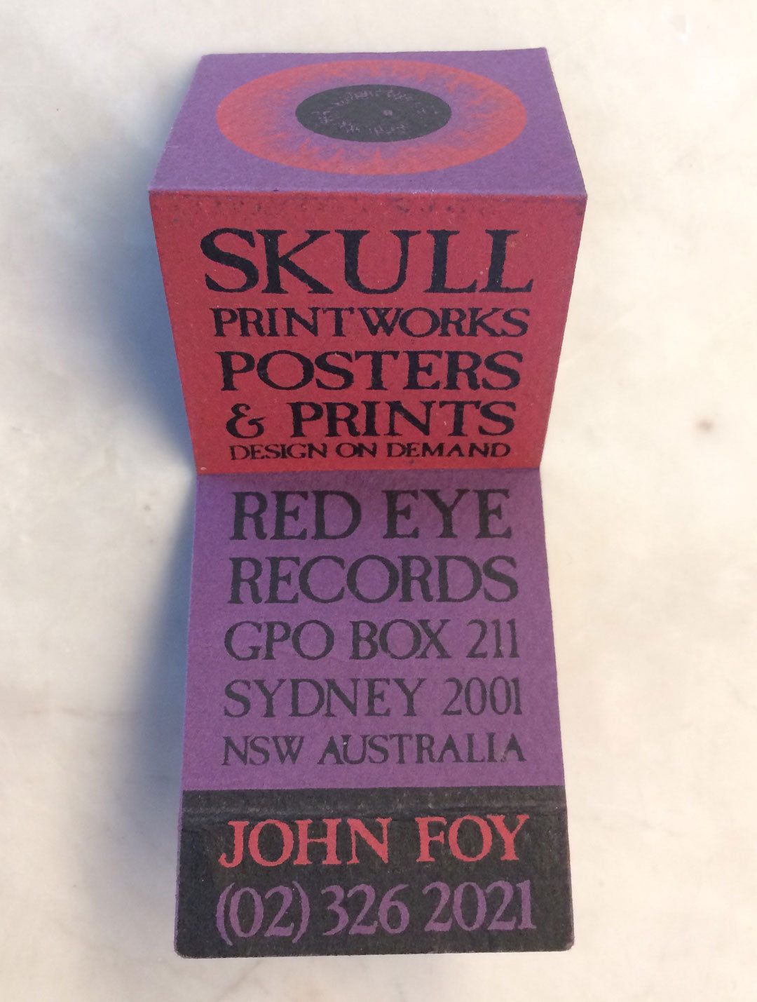
Photo: John Foy’s matchbook style screen printed business card - circa mid 1980’s.
By the early 1990’s, the heyday of the hand-crafted rock poster was largely over in Australia. As contemporary music increasingly became more of a business, price became more important than aesthetics. Other promotional avenues such as street press, free postcards, and the ever-ugly pole poster, conspired to usurp the position once held by small-run screen prints. In late 1996 Foy withdrew from contemporary music altogether. Instead he worked with various other arts and antiquities, eventually becoming a World Citizen of no fixed address until settling mostly in Cuba.